Head of Design
Creative DIrector
Gareth Fox
Hello
I've helped the world's leading Fortune 500 companies and Start-Ups drive growth and tackle their biggest challenges through design-led thinking and simple design solutions.
Creative Direction | Brand Strategy | Product Discovery | Product Strategy | Product Design | Design Sprints | Team Leadership
My process & approach
Aligning business and user goals
I create products that bridge company targets with user satisfaction, working closely with stakeholders in collaborative workshops to bring clarity to shared goals that drive both business growth and meaningful user engagement.
User-centered, data-driven design
Grounded in real user insights and frameworks like Jobs To Be Done, I build brands and products that resonate with people. Through iterative research and testing, I ensure each design decision adds value, to the overall user experience.
Impact focused design
My design work is focused on results. By aligning design with business metrics, I help deliver direct improvements to the bottom line, enhancing brand loyalty and user engagement.
Keeping teams up-to-date
Communicating the goals and progress across the company is crucial, not only for tracking the progress but for ensuring alignment. Holding regular demo sessions and retros helps keep everyone informed and working towards the same goals.
Selected cleints
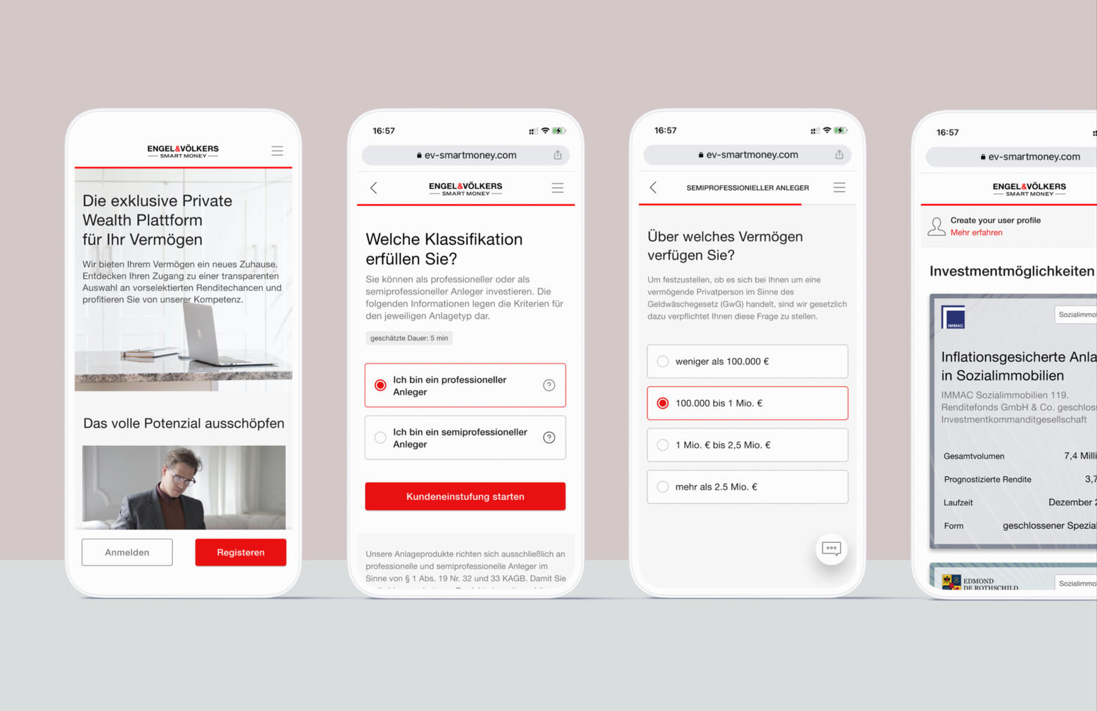
Engel & Völkers Smart Money
Investment platform
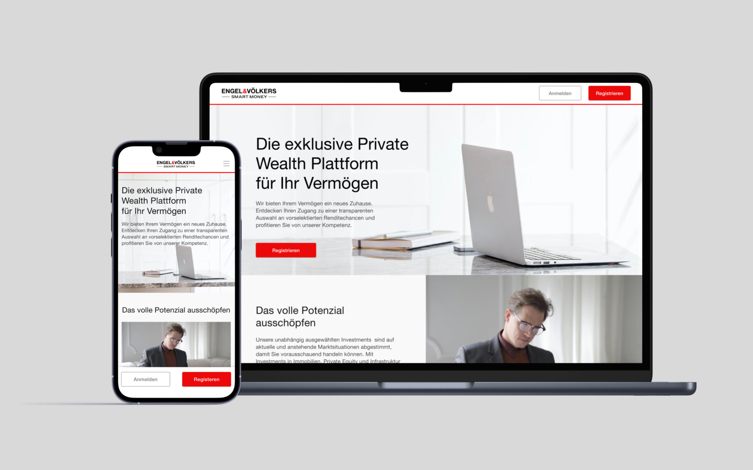
Neo-bank pivot to a real estate investment platformI led design, shaped the strategy and owned the customer journey, collaborating with the CTO, financial teams and marketing to launch within four months while working closely with the CEO on planning key next steps.
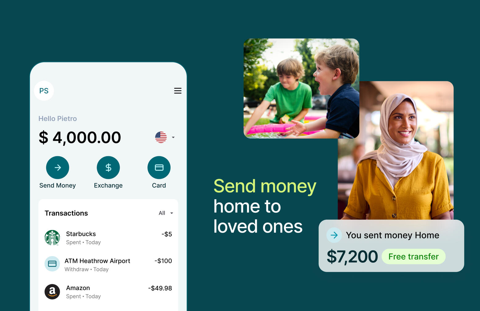
MarTrust
E-wallet and payment platform
Fintech e-wallet and FX account for the maritime industry.As freelance Head of Design, I built the new app, in six months, replacing the outdated white-label version, simplifying the B2C experience for seafarers, whilst also improving the B2B payroll and payment platforms for corporate customers
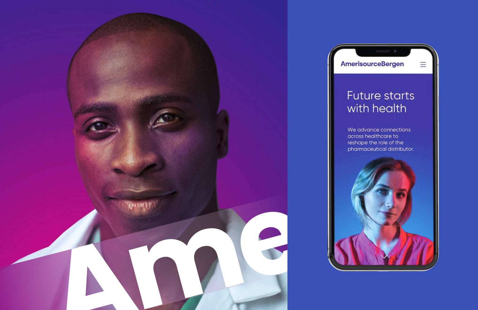
AmerisourceBergen (Cencora)
Drug wholesale & pharmaceutical distribution
Fortune 50 pharmaceutical leader in wholesale and distribution.As Creative Director, I led the brand refresh, working closely with key members of the internal team and external partners, such as Ogilvy, to launch the brand and new B2B website. I also ran workshops to guide internal teams through the transformation.
Emodo Inc.
AdTech Omni-channel Marketing Tool
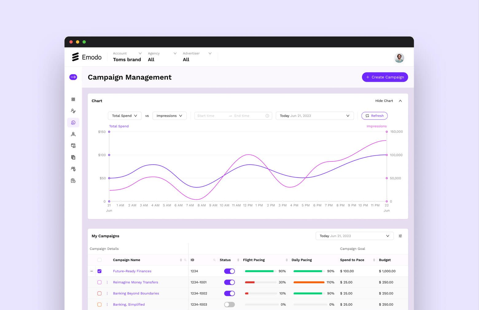
As part of the Nokia group, Emodo helps advertisers and publishers create impactful, memorable connections.Through user testing and internal workshops, I iterated and shaped the SaaS platform, simplifying the campaign setup, management, and optimisation for clients. I also supported the internal design team in implementing new ways of working.
Pizza.de
Restaurant food delivery
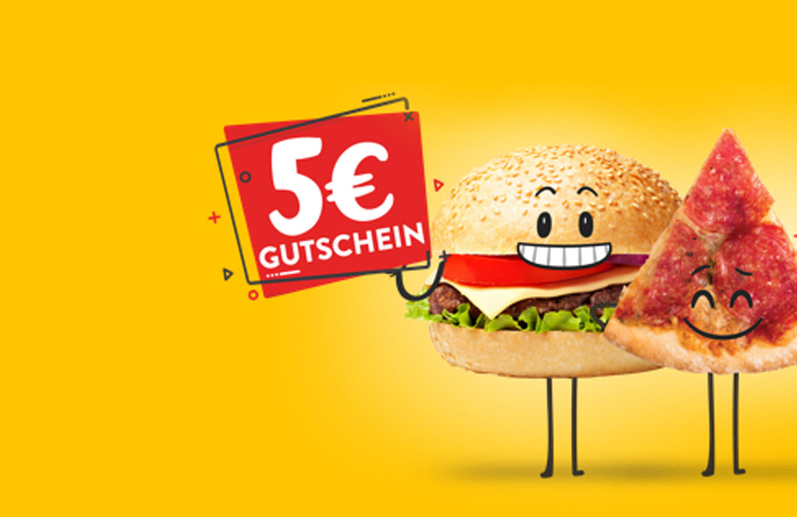
German food delivery service with a playful brand identity.I led a rebrand featuring quirky “walking food family” ambassadors and collaborated with the SEO team on Wiki pages to boost rankings. Working also closely across the product teams to elevate the user experience and customer journey.

Delivery Hero (Leiferheld)
Restaurant food delivery
Global food delivery leader serving thousands of customers in GermanyI drove design across all teams to boost growth and enhance the user experience. Collaborating with brand, marketing, SEO, and product teams, we elevated customer acquisition and improved the experience of the Leiferheld product.
How I help companies succeed
Launch fast, get feedback, hit KPIs
With a lean and efficient approach, I help companies move from idea to launch quickly, hitting KPIs that matter, whether it’s boosting engagement or driving growth. My leadership on projects like MarTrust led to a successful launch in just six months.
Building strong teams and scalable processes
I try to foster an environment of "Spaß und Stolz" (Fun and Pride), empowering teams to innovate. I focus on clear, adaptable processes, whether it's Kanban boards or design systems tailored to the team's needs, to ensure a streamlined workflow that can scale as the company grows.
Marcus Joachim
CEO, Engel & Völkers Smart Money | ex-YC (S18) | ex-Lehman
"Gareth is not only a master of his craft, with a deep understanding of design principles and techniques, but he is also a relentless advocate for the user. He consistently puts the user at the centre of everything he does and strives to create designs that are intuitive, engaging, and user-friendly."
My design principles
I believe the simplest ideas resonate the best with people. Clean, intuitive experiences foster a sense of connection with a brand and help build trust.
Empathy with the user
Starting with user needs, everything else falls into place.
Keep it simple
Less complexity means more impact.
Collaborative innovation
The best ideas come from team synergy.
Continuous improvement
Design is never finished—it’s always evolving.
Companies I've helped


Let's chat
I’m a Berlin-based Head of Design and Creative Director, currently freelancing and fluent in both English and German. For a detailed case study or to discuss potential collaboration, feel free to reach out. Looking forward to connecting soon! 🚀
Creative Direction | Brand Strategy | Product Discovery | Product Strategy | Product Design | Design Sprints | Team Leadership

Gareth Fox | Berlin, Germany
Tel.: +49 17620631729
Email: garethwfox@gmail.com
Umsatzsteuer-ID: DE314459518
The neo-bank pivot
Engel & Völkers Smart Money launched its consumer bank and app in 2020, offering customers contactless payment & Apple Pay, instant money transfers, and the benefits of a trusted German brand. The next step was to build an additional wealth investment platform, enabling users to invest in private equity and real estate funds.However, in 2021, we (the company) pivoted from the neo banking app to an investment-only platform, closing the bank. Within a four-month window, the goal was to design, build, and launch the Engel & Völkers Smart Money investment platform, enabling customers to invest a minimum of €200,000 in Real Estate and Private Equity Investments.
The challenge
Our challenge was to design an investment experience that seamlessly integrated all internal and external partners and tech, while also being intuitive and compelling for potential investors, instilling confidence that their investments are in good hands.
Research and personas
Although the initial data from the banking app provided us with some insight into investor behaviour, I saw the need to expand our understanding. I looked to engage a wider user base to identify common barriers to investing and gather more comprehensive data on general behaviour. The research aimed to address three overarching questions:
Who are the most motivated potential investors?
What are their financial behaviours?
What are their investment goals?
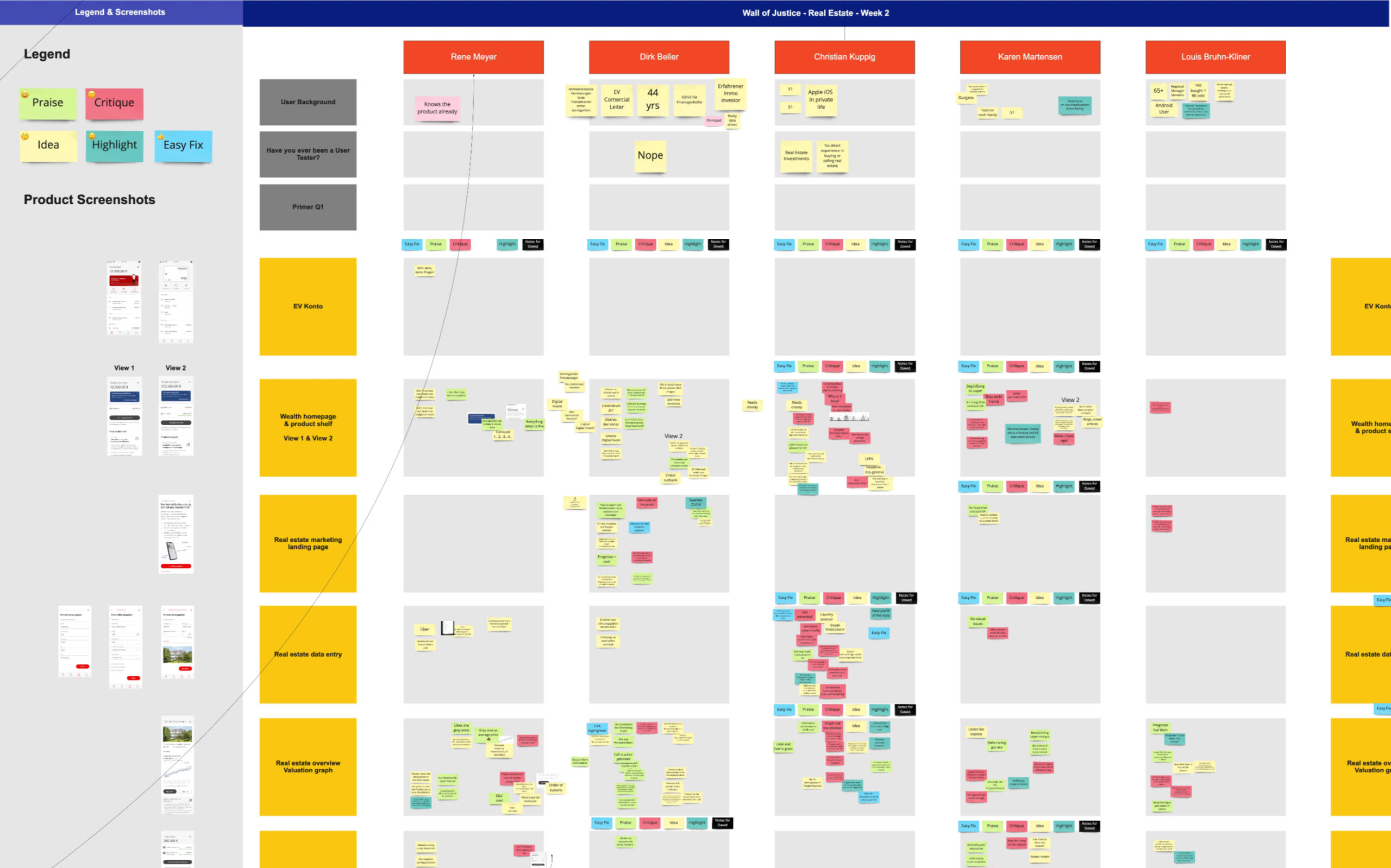
Collecting user feedback from interviews
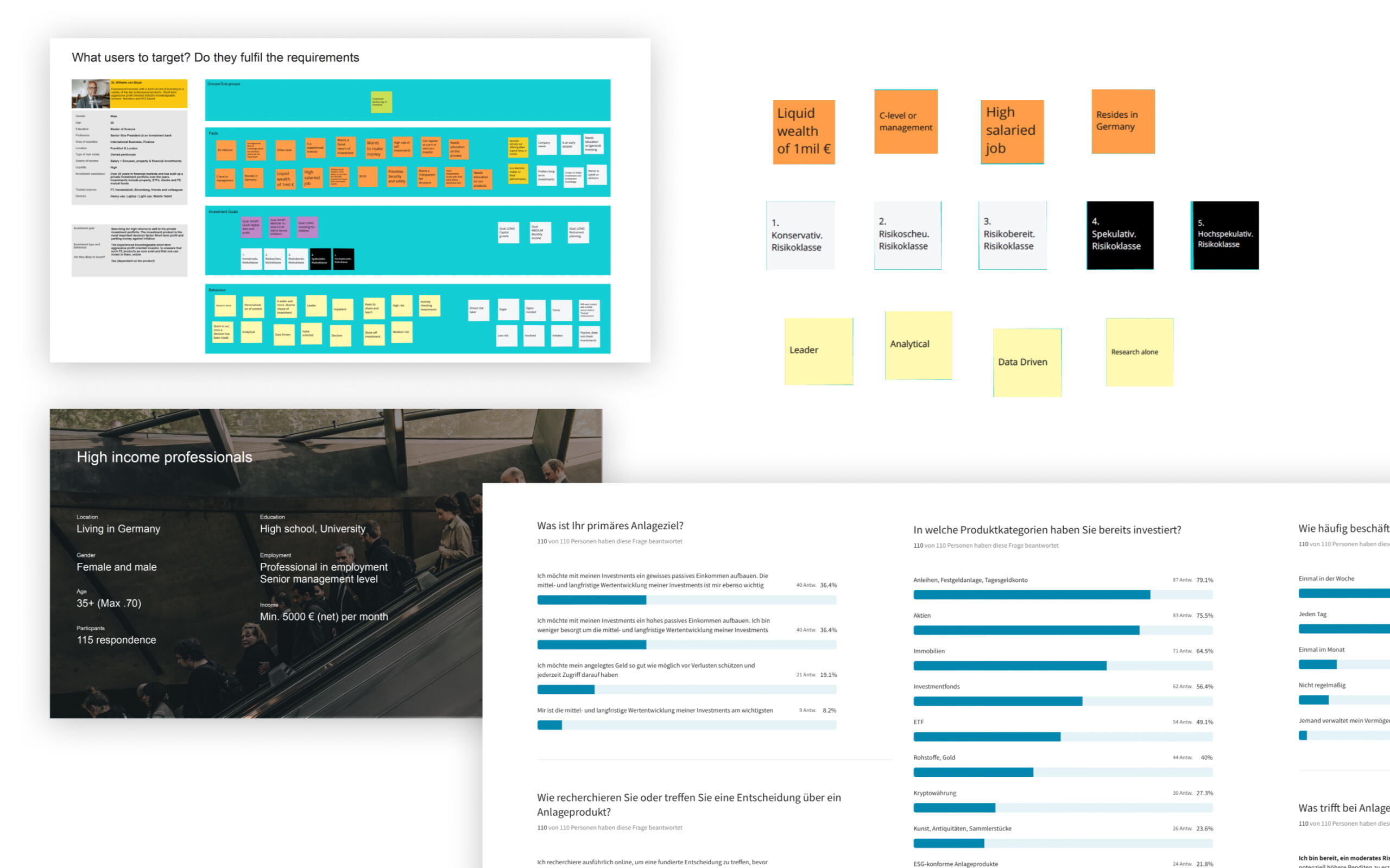
Summary of user insights and survey results
Learnings and what this meant for us
Through interviews with existing banking and potential new customers, competitor research, and surveys sent to HNWIs, I was able to confirm some assumptions and gain a better picture of our target customer. The main findings were:
HNWIs were the most invested and actively looked to grow their money through investing. The most motivated were medical professionals, managers at large corporations, and freelancers or business owners.
This group was highly engaged, took a regular interest in their finances, and was often methodical before committing to invest.
Potential investors preferred the lower risk investment spectrum but were willing to take a small risk to ensure gains.
Regular income above long-term investment growth was their preferred option.
Shaping the persona and Tone-of-Voice
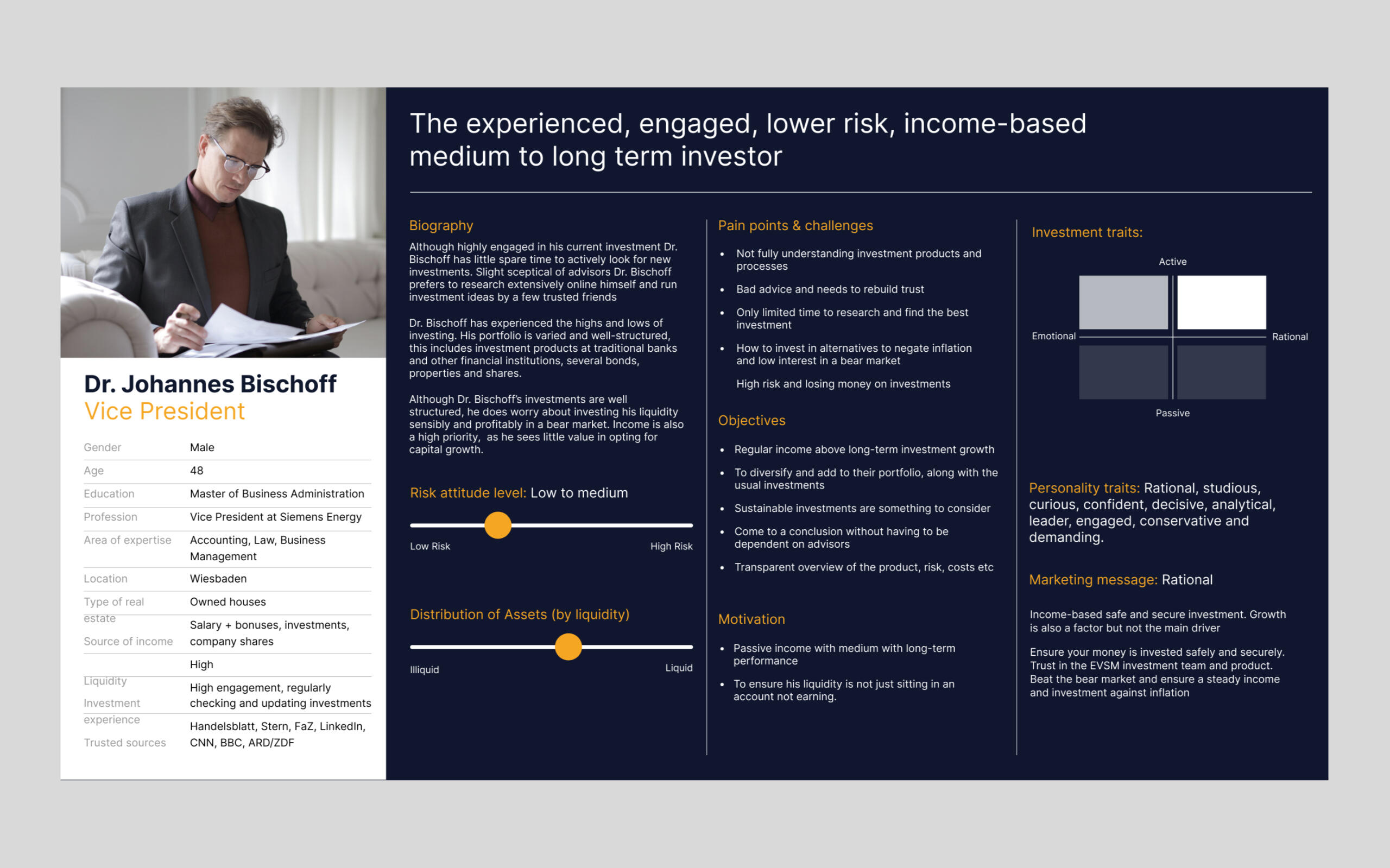
These learnings helped shape the persona and the direction of the investment platform, website, and marketing materials that considered the user's behavioural traits and motivations. The following features were highlighted:
Providing investment opportunities that were unavailable to everyday investors and offer low-risk products and income-based investments over growth.
Leveraging the Engel & Völkers brand to build trust.
Enhancing the user's understanding of the investment product by offering clear, factual information and minimizing the use of financial jargon. Additionally, a well-crafted FAQ section can provide a valuable resource for potential investors.
Focus on creating a great onboarding experience, which was seen as a key part of the product and investment experience.
Smart Money reimagined. The platform for real estate investments
Real estate should be seen as an investment, to be sold and reinvested
The design process
The investment platform required a minimum investment of €200,000, making it crucial to build trust and create an intuitive, compelling and informative experience that relayed any anxieties the potential investors may have. The platform had to work seamlessly, guiding users through the investment process step-by-step.
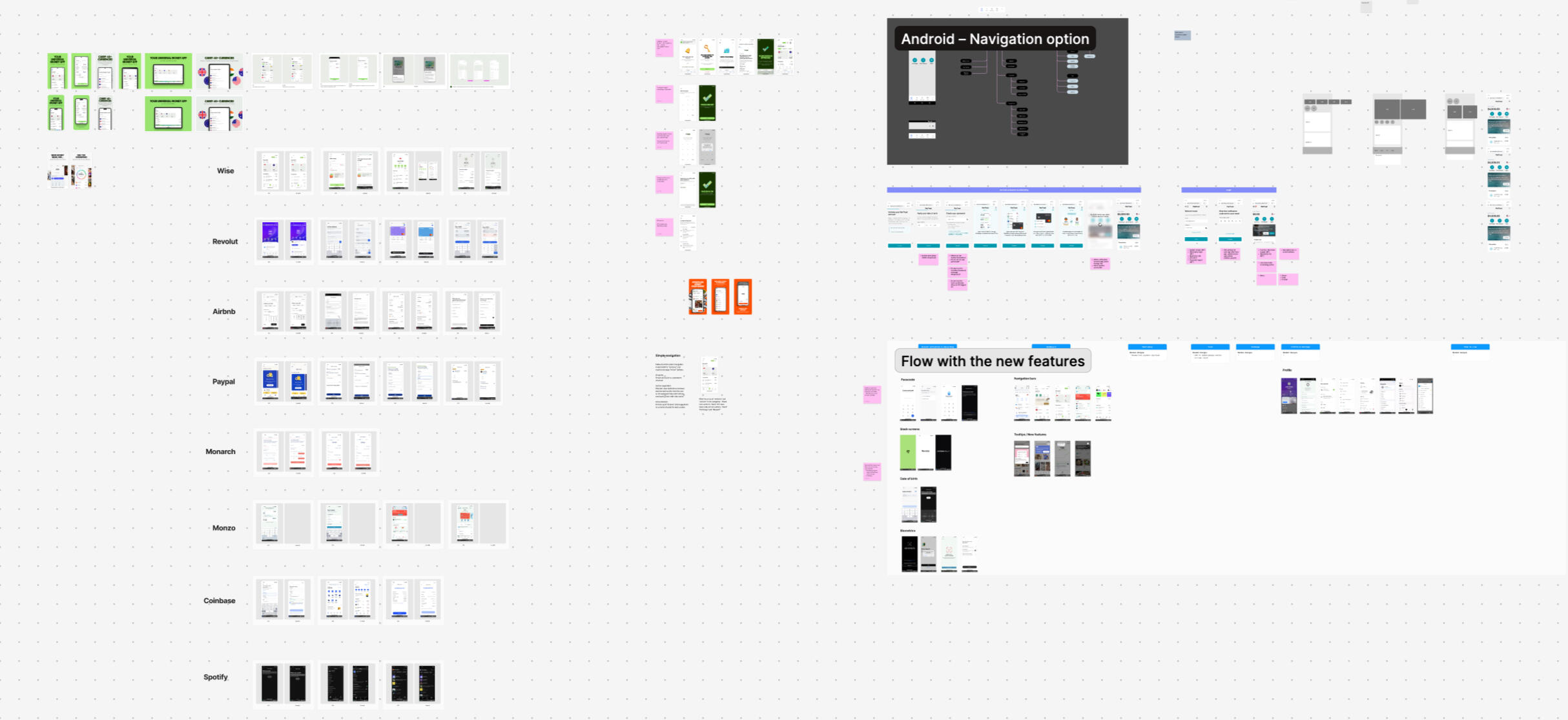
Competitor research and summary
1. Cross team alignment
The entire customer journey was mapped out by all the internal teams, including marketing, finance, and engineering.I ran and held workshops to plan and align each stage in advance. The design team worked two weeks ahead of the tech team to ensure a steady stream of tasks. The flow was broken down into sections, tracked in Jira, and handed over to the engineering team.
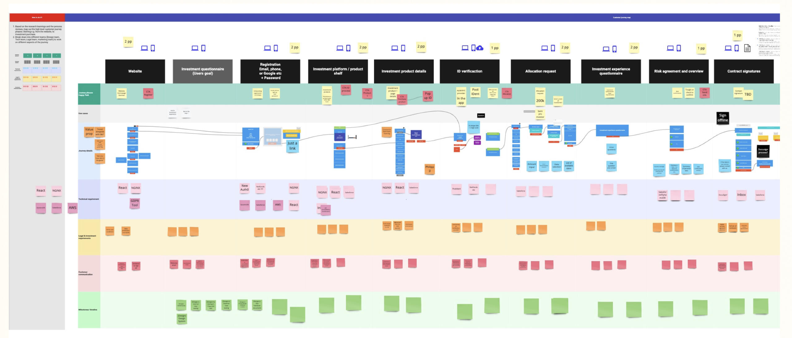
Customer journey mapping
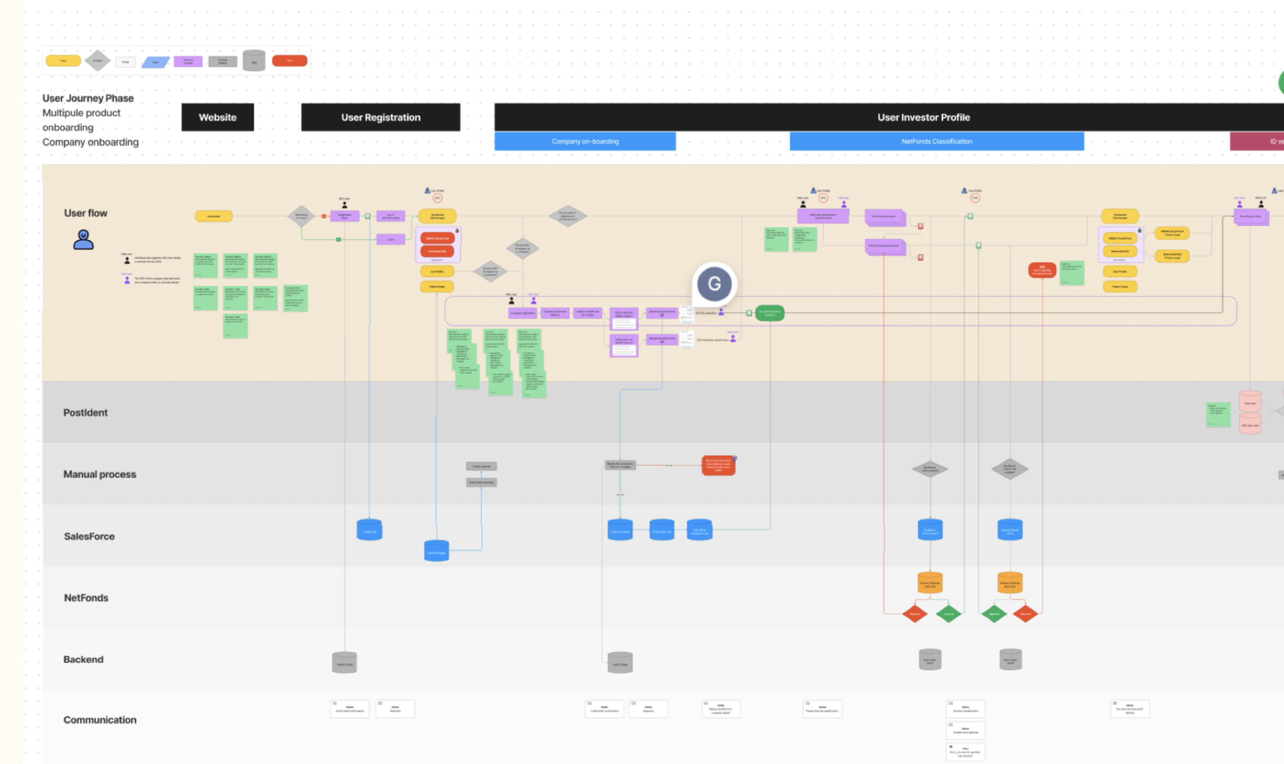
User journey through the platform
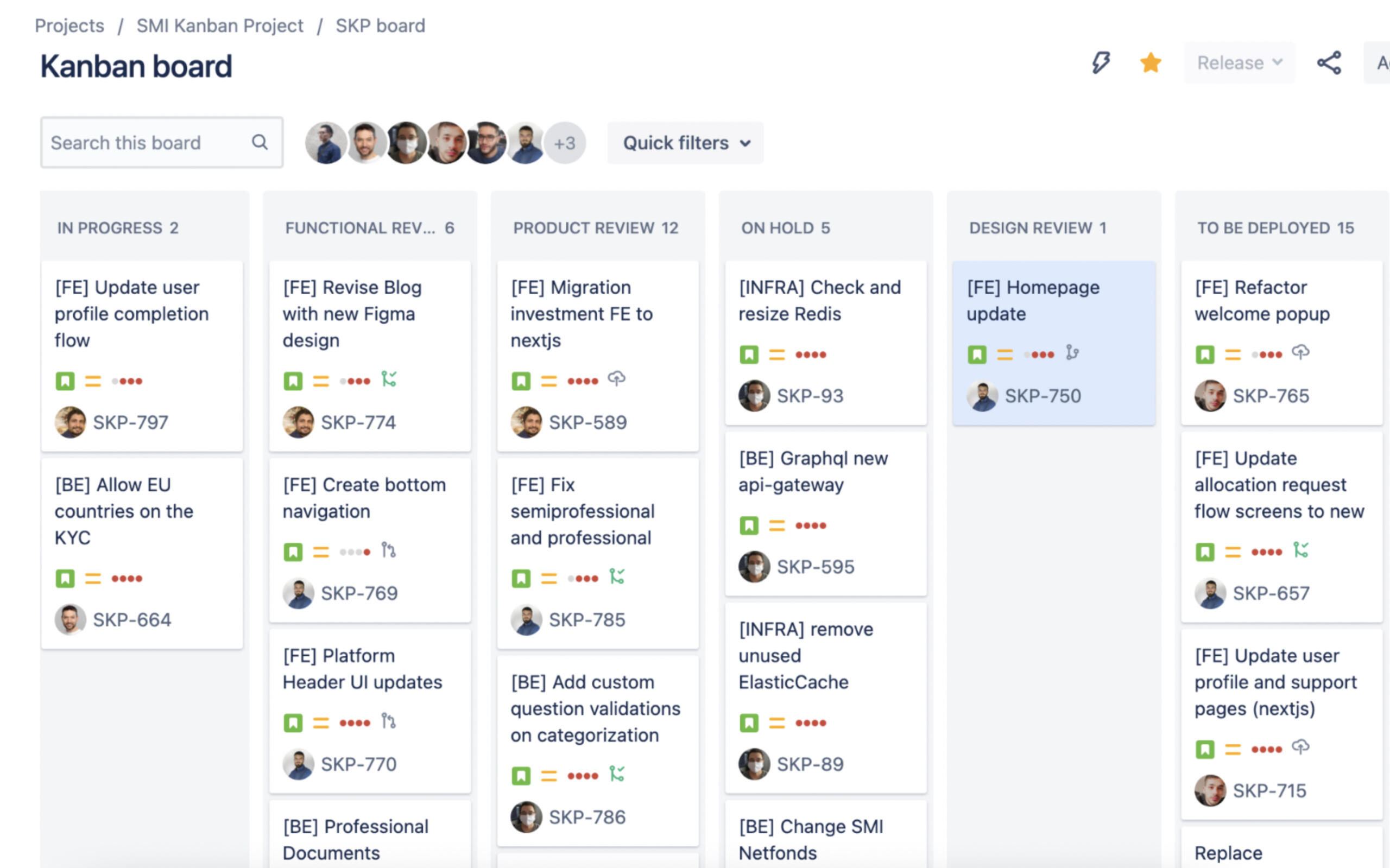
Jira board planning
2. Prototypes, testing, and handovers
The design process was collaborative, especially with the engineering team, to reach the four-month deadline. Daily stand-ups, quick sketches, wireframes, and prototypes were created to discuss, get feedback, and test with a small group of users.A storybook of library components and modules was created in collaboration with the front-end developers to allow faster creation of all screen designs.
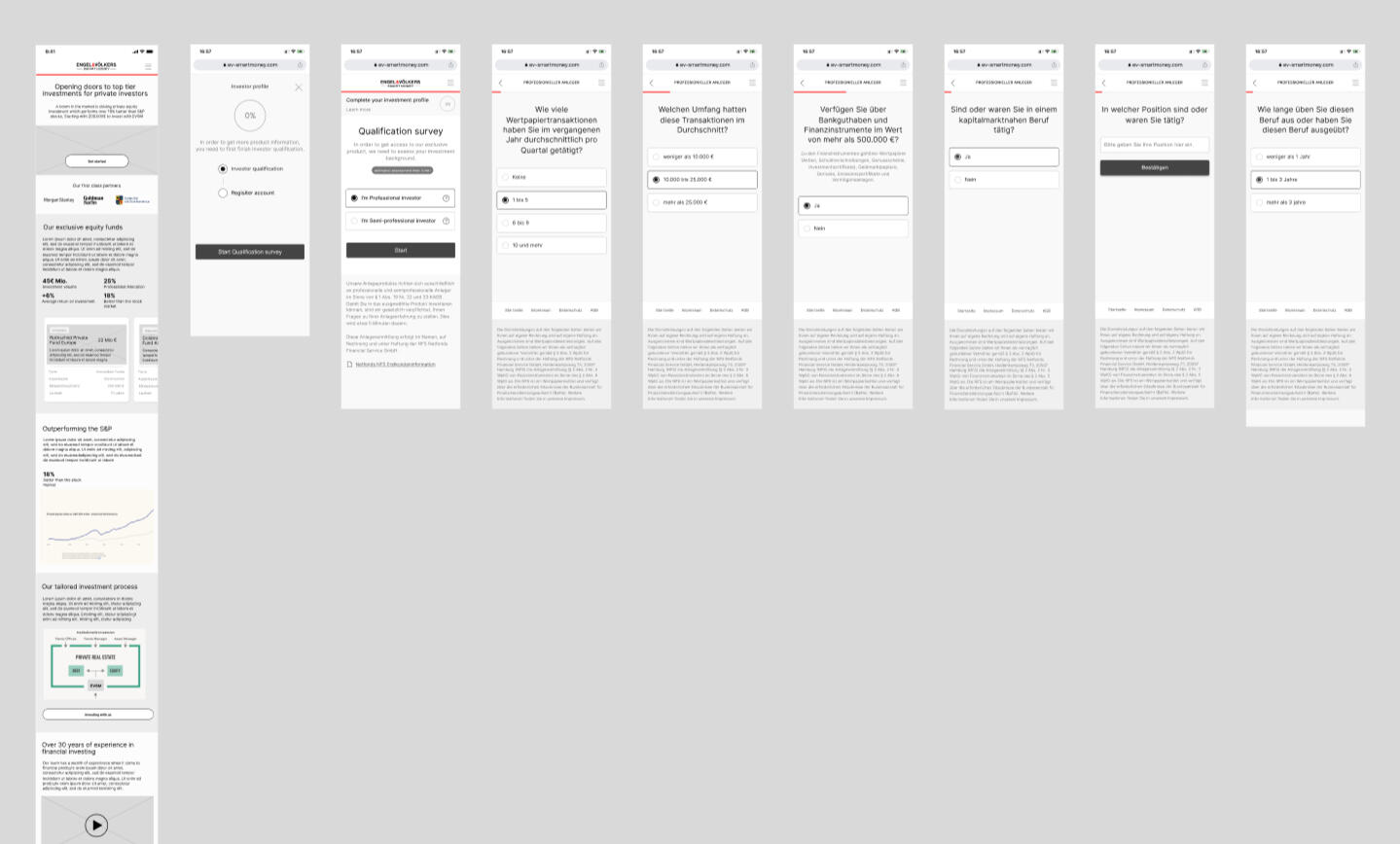
3. Creating an intuitive Investment Product
At Engel & Völkers Smart Money, we wanted to create an investment product that was simple to understand, easy to navigate, and informative for potential investors.To ensure we reached this product goal, I communicated our design decisions and non-negotiables and established a set of design principles. These principles helped the product team stay focused on our goal of creating a user-friendly platform.
4. Defining design principles
Take users by the hand
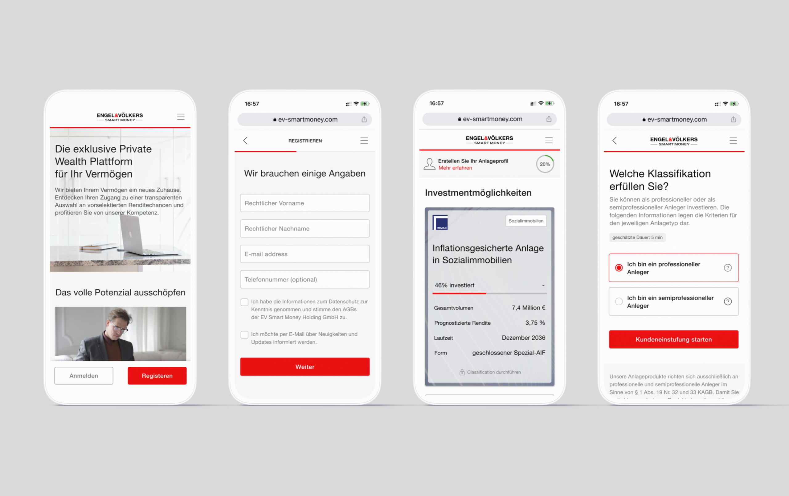
To guide users through the onboarding process, we created separate sections for each stage of the process. We communicated the next steps that users should expect, as well as any waiting times in the process. By breaking down the process into manageable steps, we could help users feel more in control and informed.
Provide help and assistance
To provide users with assistance, we included tips and help throughout the onboarding process. We also allowed users to save and return later to complete the process. Users were also given the option to call our support team at any stage in the investment process. By designing a user-friendly experience, we could help users feel more confident in their decisions.
One screen, one question
We kept questionnaire and survey questions limited to one screen. By focusing on one job per screen, we removed any unnecessary clutter and did not overwhelm users during an already complex process
Crystal clear content
We kept financial information short and jargon-free. Additionally, we designed a comprehensive and well-structured FAQs section to answer users' questions in detail.
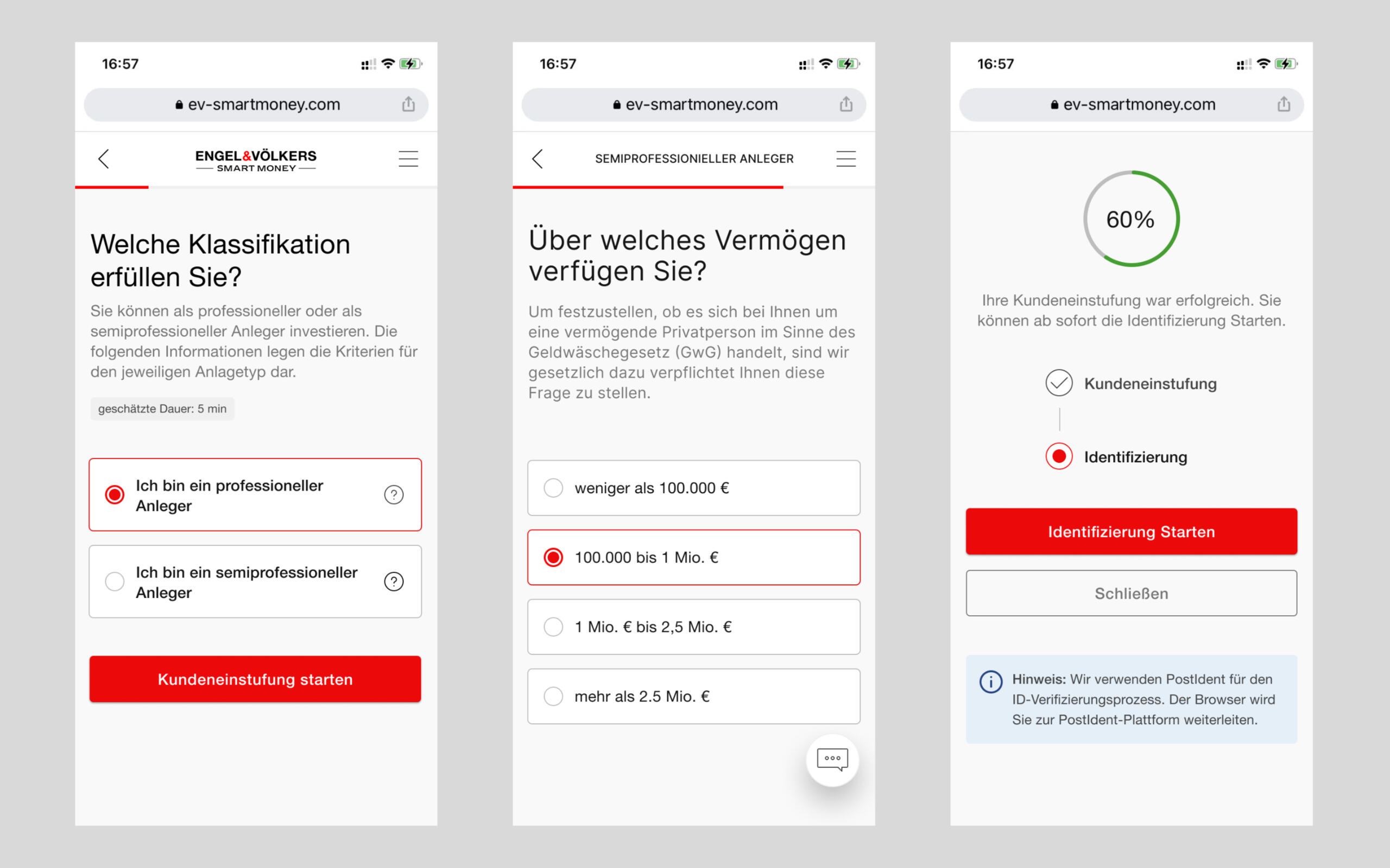
5. Designing the onboarding
I knew that the onboarding process was the key component of our platform, as first impressions count. To make the process more manageable, we separated potential investors into two categories (Professional and Semi-Professional). This made it easier for our finance team to review and categorise each investor.Through testing, I discovered that users had misgivings about committing to verifying their identity as one of the first steps in the process. I addressed this by moving this step further down the onboarding process, allowing users to gain more information and trust before committing to verification which led to an uptake in registered users.
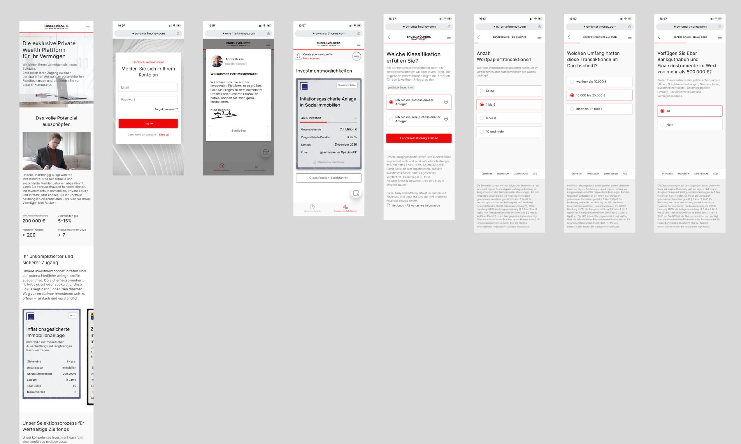
The Result
By pivoting from banking towards investment, we could cut a loss-generating part of our business and focus on doing one thing well. Within four months, we launched our investment platform and gained over 200 signed-up customers in the first two months after launch.The success of our platform was due in part to our structured and communicative approach with other teams, including engineering, finance, and marketing. The planning in advance, allowed us to execute quickly and avoid surprises.Through testing, I was able to provide a seamless and easy-to-use onboarding experience, and our finance team could source new products that potential investors were keen to invest in. After launch, we gained real-life data, which allowed us to iterate further on the investment platform.
Gareth Fox | Berlin, Germany
Tel.: +49 17620631729
Email: garethwfox@gmail.com
Umsatzsteuer-ID: DE314459518